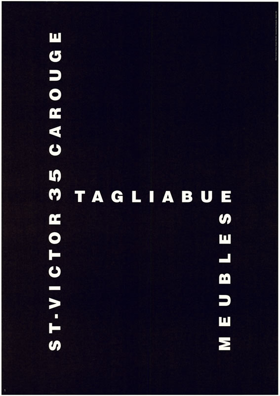
As a n avid music listener, the front and back side of an album or CD cover is one of the first things we observe before we actually get to listen to the artist music. Stefan Sagmeister has created album works for the likes of The Rolling Stones, Aerosmith and Jay Z just to name a few.
Tuesday, April 30, 2019
Stefan Sagmeister
Stefan Sagmeister:
As a n avid music listener, the front and back side of an album or CD cover is one of the first things we observe before we actually get to listen to the artist music. Stefan Sagmeister has created album works for the likes of The Rolling Stones, Aerosmith and Jay Z just to name a few.


As a n avid music listener, the front and back side of an album or CD cover is one of the first things we observe before we actually get to listen to the artist music. Stefan Sagmeister has created album works for the likes of The Rolling Stones, Aerosmith and Jay Z just to name a few.
Storm Thorgerson
Storm Thorguson:
Each week upon choosing a new graphic designer to expand on and summarize I have found many graphic artist who i can either relate to them or their works of art. This week I stumbled upon Storm Thorguson, who is a graphic designer involved in music videos and the music industry. He is responsible for creating gone of the most well know as well as sought after album covers of any generation, Pink Floyd's " Dark Side of the Moon" Album . along with this historic accomplishment Thorguson has worked with some of the most famous names in classic rock such as Led Zeppelin, Phish, Black Sabbath, Peter Gabriel and the Alan Parson Project.

Each week upon choosing a new graphic designer to expand on and summarize I have found many graphic artist who i can either relate to them or their works of art. This week I stumbled upon Storm Thorguson, who is a graphic designer involved in music videos and the music industry. He is responsible for creating gone of the most well know as well as sought after album covers of any generation, Pink Floyd's " Dark Side of the Moon" Album . along with this historic accomplishment Thorguson has worked with some of the most famous names in classic rock such as Led Zeppelin, Phish, Black Sabbath, Peter Gabriel and the Alan Parson Project.
Wim Crouwel
Responsible for most of the work of the Stedelijk Museum, Wim Crouwel is a graphic designer well-known as one of the founders of Total design, design studio. He was a teacher and firm believer in using cathode ray tube technology. Although it latter became popular Crouwel believed the new alphabet to be over the top and not very functional. He was well-known in grid-based layouts and typography.


Monday, April 29, 2019
Susan Kare
Susan Kare is an artist and graphic designer who formerly
worked for Apple Macintosh in the 1980’s creating many of the interface
elements and typefaces. She started off at Macintosh as part of the design team
who created graphics and fonts for the program. Later, she was promoted to a Creative
Director in Apple Creative Services working for Tom Suiter, the Director of the
organization. Kare is one of the many foundation graphic designers of the
original Apple Macintosh company. She exhibited many ground breaking works of
art that are still recognizable in the computer graphics tools and accessories of
the brand. Her most recognizable works with Apple are the “Chicago typeface
seen in the classic Mac OS interfaces from System 1 in 1984 to Mac OS9 in 1999,
as well as the typeface used in the first four generations of the Apple iPod.”
Also the Geneva typeface, the “Happy Mac” icon (the smiling icon that came on
the screen when Mac users would start up their computer) and the Command key symbol
on Apple keyboards.
After Apple, Kare went on to work for NeXT as a
designer working for companies such as IBM and Microsoft. Some of her designs for
Microsoft included the Notepad, the deck for solitaire and control panels. For
IBM, she designed icons for OS/2 and contributed iconography for the Nautilus
file manage.
As Susan Kare’s life went on she worked for many
companies that involved graphical design. Some of the many places are Facebook
where she created the “Gifts” feature. She also designed the identity icons and
website for Chumby Industries, Inc as well as their internet enabled alarm clock.
Recently, Kare was hired to Pinterest as a product design lead. Kare also makes
many art images for Kare Prints, a website where she post her work on. She
enjoys using Adobe Photoshop and Adobe Illustrator to make her designs and
logos now. Susan Kare is definitely keeping up with times, even at 65 years
young.
Emil Ruder
Emil
Ruder (1914–1970)
was a Swiss typographer and graphic
designer, who with Armin Hofmann joined
the faculty of the Schule für Gestaltung Basel (Basel
School of Design).
He is
distinguishable in the field of typography for developing a holistic approach
to designing and teaching that consisted of philosophy, theory and a systematic
practical methodology. He expressed
lofty aspirations for graphic design, writing that part of its function was to
promote 'the good and the beautiful in word and image and to open the way to
the arts' (TM, November 1952 Issue). He was one of the major contributors
to Swiss Style design. He taught that typography's purpose was to communicate
ideas through writing, as well as placing a heavy importance on Sans-serif
typefaces. No other designer since Jan
Tschichold was as committed as Ruder to the discipline of
letterpress typography or wrote about it with such conviction.
Sunday, April 28, 2019
Saturday, April 27, 2019
Jessica Walsh
Jessica Walsh
She is a designer and art director, she works as a partner at
Sagmeister & Walsh. She currently lectures at conferences and universities
both locally and internationally. Jessica was once referred to by Observer
Magazine as “Graphic Design’s “It”Girl”. She attended the Rhode Island School
of Design and worked for Apple. Her desires
to challenge the norm and to branch out lead her to work with the firm Pentagram.
She had many skills including coding, she created at 11 years old a website
offering free graphic templates. With her current firm she gets variety in her
day, she can do a campaign for a luxury store one day then the next work with a
rapper in the music industry. She wanted diversity in her career from the very
beginning an now she is able to do that and more including blogs and lecturing.
Lorraine Wild
Lorraine Wild
Lorraine wild has designed over 70 books, she graduated from
the Yale school of art. She has never been considered traditional, instead
views herself as a modernist. She teaches while continuing to create design
books. She is frustrated with being boxed in as only a design book artist. She
started her own practice, and herself was a subject of an exhibition.
Week 6 Graphic Designer- Luke Choice
Velvet Spectrum is the creative studio of Australian Visual Artist Luke Choice, based in Portland, Oregon.
Working across multiple disciplines creates a portfolio with a strong focus on visual storytellingm through the use of dynamic color and composition. Bringing together typography, illustration and motion graphics to create the surreal and unexpected for client including... Ray-Ban, Nike, American Express, Google, HBO, Adidas, and Adobe to name a few.
His work is really incredible and worth taking a look at either on Instagram, Pinterest or Behance.


Week#7 Graphic Artist Chipp KIdd


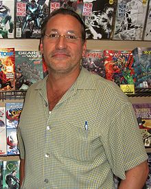 Chipp Kidd a New York graphic
designer, is best known for his book cover designs. He is one of the countries
most famous book cover designers. Kidd grew up in Pennsylvania and in1986 he graduated
from the University of Pennsylvania. Growing up Kidd was inspired by Batman and
Superman comic books, as were many kids of that era. Kidd took his love for
superheroes to the next level it was his inspiration for him getting his
degree in graphic arts. Throughout his career, Kidd has been a Graphic Designer,
Lecturer, Book Designer, and a Musician.
Throughout the graphic
design world, it is noted that Kidd is not known for a signature design. Kidd
says “That a signature design is crippling” he further states that…{Because}
the simplest and effective solutions aren’t dictated by the style.” Kidd is currently the associate art director
at Knopf, an imprint of Random House. He has freelanced for Amazon, Doubleday,
Farrar Straus & Giroux and others. In 2003 he collaborated with Art Spiegelman
on a biography of cartoonist Jack Cole and Plastic Man. Kidd has worked on a plethora
of books covers including books by Mark Beyer, Bret Easton Ellis, Haruki
Murakami and many others.
Publisher
Weekly describes Kidd's book jackets as “creepy, striking,
sly, smart unpredictable covers that the readers appreciate books as objects of
art as well as literature”. USA notes
“he is the closest thing to a rock star”. Author James Elroy says Kidd is “the world’s
greatest book – jacket designer.” Kidd has often downplayed the importance of
his artwork, in terms of aiding towards
the selling of books. He is been quoted as saying” "I'm very much against the idea that
the cover will sell the book. Marketing departments of publishing houses tend
to latch onto this concept and they can't let go. But it's about whether the
book itself really connects with the public, and the cover is only a small part
of that." He is also known to be humorously self - deprecating about his work with statements such as
"I piggyback my career
on the backs of authors, not the other way. around. The latest example of that
is The Road, by Cormac McCarthy. I'm lucky to be attached to that. Cormac McCarthy is not lucky to have me doing
his cover. “There is something beautiful in modesty.”
Week 5 Graphic Designer - Shepard Fairey
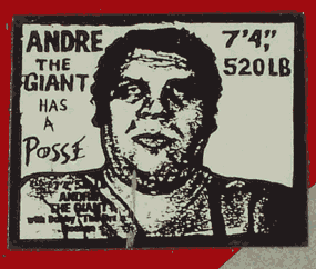
Frank Shepard Fairey is an American contemporary street artist, graphic designer, activist, illustrator, and founder of OBEY Clothing who emerged from the skateboarding scene. He first became known for his "Andre the Giant Has a Posse" (...OBEY...) sticker campaign while attending the Rhode Island School of Design, which appropriated images from the comedic supermarket tabloid Weekly World News.
He became widely known during the 2008 U.S. presidential campaign for his Barack Obama "Hope" poster. The Insitute of Contemporary Art, Boston has described him as one of the best known and most influential stret artists. His work included is in the collections at The Smithsonian, the Los Angeles COunty Museum of Art, the Museum of Modern Art in NYC, the Museum of Contemporary Art San Diego, the National Portrait Gallery in Washington D.C., the Virginia Muserum of Fine Arts in Richmond, and the Victorian and Albert Museum in London.

He became widely known during the 2008 U.S. presidential campaign for his Barack Obama "Hope" poster. The Insitute of Contemporary Art, Boston has described him as one of the best known and most influential stret artists. His work included is in the collections at The Smithsonian, the Los Angeles COunty Museum of Art, the Museum of Modern Art in NYC, the Museum of Contemporary Art San Diego, the National Portrait Gallery in Washington D.C., the Virginia Muserum of Fine Arts in Richmond, and the Victorian and Albert Museum in London.


Friday, April 26, 2019
Thursday, April 25, 2019
Jury Wajdowicz’s
His work is self-described as “floats between
representation and abstraction….Hovering between a photograph and a painting” (JW). His work is difficult to describe he doesn’t use
photo editing, but he uses light and blurs the image with the lenses to create
abstract art. Looking through his work it is hard to not think this is water
colored art or layered images using other editing tools. I looked at his
collections and some are named after countries thinking of the country and
looking at the pieces changes what your first interpretation was of his work.
One piece that stood out to me the most was part of his Morocco collection.
When I first saw it I thought of a metropolitan area a computer room, then I see
that it was part of a collection. Then I saw the sun setting in a hot desert.
Week 6: Neville Brody
Week 5 Artist ( Chip Kidd)
Wednesday, April 24, 2019
week 6 graphic designer
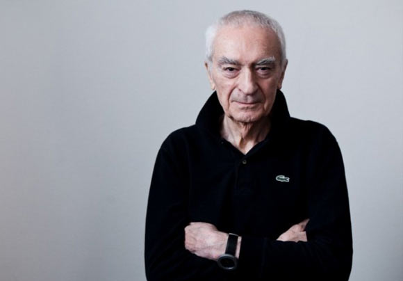
On January 10, 1931, Massimo Vignelli was born in Milan, Italy. He attended an art school, Accademia di Belle Arti di Brera, before earning an Architecture degree from the Politecnico di Milano, 1953. During the period between 1953 and 1957, he attended the School of Architecture and University of Venice. Early in his professional career, his chief area of expertise was graphic designing for products and corporate identity creation. Also Vignelli tweaked a design for the ‘Fungo’ table lamp by creating a series of lighting fixtures. In the late 1950s, he earned a fellowship to study in United States at Towle Silversmiths, Massachusetts and the Institute of Design, Chicago. In 1957, he married Lella Vignelli, whom he met at an architecture convention. A few years later they established their small design studio, the Lella and Massimo Vignelli Office of Design and Architecture, Milan. The studio dealt with designing domestic products, office accessories, graphics and furniture. In addition to art direction, Vignelli also penned a book, titled Vignelli: From A to Z. The book details Vignelli’s ideas and vision with regard to graphic designing in the form of essays. The essays are organized in an alphabetical order as hinted in the title. In fact, they are based on somewhat the same course Vignelli gave lectures on while teaching at Harvard’s School of Design and Architecture. In 2009, Vignelli launched a free e-book, The Vignelli Canon,with the aim of passing on his legacy and treasure of knowledge on designing to young designers. Massimo Vignelli died on May 27, 2014, after a long period of illness.
https://www.famousgraphicdesigners.org/massimo-vignelli
Subscribe to:
Comments (Atom)


